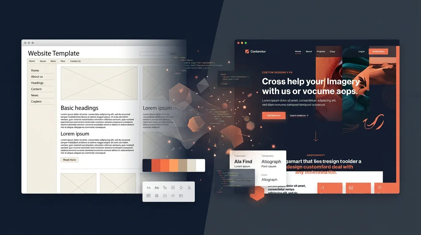
Redesign Series Part 3: Design – From Colour Palette to Design System

TL;DR: „Colours aren't decoration – they're decisions. Here's how a handful of principles became a complete design system."
— Till FreitagThis is Part 3 of our Redesign Series. Part 2: Strategy – Positioning, Target Audiences and Content Architecture
Colours Are Decisions
Every colour on a website is a statement. It says: "This is important", "These belong together" or "Click me". If you choose colours randomly, you send random signals. So we justified every single colour.
The Palette: Four Colours, One System
Turquoise (#40eee6) – The Accent
Turquoise is our signal colour. It appears wherever something deserves attention: badges, hover states, decorative elements. Not loud enough to shout. Loud enough to stand out.
Why turquoise? Because it sits between blue (trust) and green (growth). And because it glows against navy backgrounds like a lighthouse.
Bright Blue (#3264fa) – The Identity
Our primary blue is the face of the brand. Headlines, links, primary buttons – everything that says "this is Till Freitag". Bold enough for contrast, professional enough for B2B.
Bold Yellow (#ffcc00) – The Call to Action
Yellow is reserved for exactly one job: Call to Action. "Book a call", "Get started", "Schedule now" – if it's yellow, it should be clicked. This exclusivity makes yellow powerful. If we used it everywhere, it would lose its impact.
Navy (#1a2744) – The Stage
Navy is our dark value. Footer, feature sections, hero areas – everywhere content needs depth. Navy replaces black because pure black (#000) looks harsh and unfriendly on screens. Navy has warmth.
Warm Black (#3c3c3c) – Readability
For body text, we don't use pure black but a warm dark grey. The difference is subtle but noticeable: text feels more comfortable, eyes tire less. A detail nobody notices – but everyone feels.
Typography: One Font, Four Weights
Why Only Montserrat?
The temptation is strong to combine multiple fonts. One for headlines, one for body, maybe another for accents. The result? Visual noise.
We chose Montserrat as our only font – and use weight as a design tool instead:
| Weight | Usage | Example |
|---|---|---|
| Regular (400) | Body text, descriptions | Paragraphs, lists |
| Medium (500) | Labels, navigation | Menu items, captions |
| Semibold (600) | Subheadings, buttons | Card titles, CTAs |
| Bold (700) | Headlines | H1, H2, hero text |
The principle: the more important the text, the heavier the weight. Simple, consistent, scalable.
Playfair Display – The Reserve
We registered Playfair Display (a serif font) in the system but deliberately don't use it. Why keep it? In case we need editorial formats in the future – quotes, magazine layouts, editorial content. The option exists without diluting the current look.
Glassmorphism: Depth Without Weight
A design trend we use deliberately – not as a gimmick, but as a design principle.
What Is Glassmorphism?
Semi-transparent surfaces with a blur effect that create the impression of glass. Elements behind them shimmer through, suggesting depth and layering.
Where We Use It
- Cards and panels –
bg-white/80 backdrop-blur-sminstead of solid backgrounds - Decorative blur orbs – Large, blurred colour areas (turquoise, blue) as background elements
- Navigation – Slightly transparent header that lets content show through when scrolling
Where We Don't Use It
- Text on critical CTAs – Readability beats aesthetics
- Mobile on weak hardware –
backdrop-bluris GPU-intensive; we reduce effects on small devices - Everywhere at once – If everything is glass, nothing is special
The Design System: From Tokens to Components
Why a Design System?
Without a system, this happens: Developer A uses #3264fa, Developer B uses rgb(50, 100, 250), Developer C types blue-600. Three people, one blue, three different values. When the colour changes, all three spots need finding.
Our approach: Semantic Tokens. Every colour is defined once and referenced via CSS variables.
:root {
  --primary: 224 96% 59%;      /* Bright Blue */
  --turquoise: 177 82% 59%;    /* Accent */
  --yellow: 48 100% 50%;       /* CTAs */
  --navy: 224 50% 20%;         /* Dark sections */
}
In code, it's bg-primary instead of bg-[#3264fa]. One change in one place changes everything.
Button Variants as an Example
Instead of styling every button individually, we standardised three CTA variants:
| Variant | Colour | Usage |
|---|---|---|
cta | Yellow | Primary call to action |
ctaOutline | Blue border | Secondary CTA on light backgrounds |
ctaOutlineDark | Subtle border | Secondary CTA on navy backgrounds |
Every page uses at most two CTAs: one primary (yellow) and one secondary (outline). That's all you need.
Shadows with System
Shadows are tokenised too:
shadow-soft– Subtle elevation for calm elementsshadow-card– Standard for cards at restshadow-hover– Blue-tinted, for hover states – a subtle hint at interactivity
Animations: Motion with Purpose
We use Framer Motion for scroll animations. The rule: Every animation must have a function.
- Fade-in from below – Signals "new content"
- Staggered children – Shows items belong together in lists
- Scale-in – Emphasises importance
What we don't do: parallax scrolling, auto-play carousels, blinking elements. Subtlety beats spectacle.
Responsive Design: Mobile-First Thinking
Our grid system:
- Mobile (< 768px) – Single-column layout, reduced spacing, simplified navigation
- Tablet (768px – 1024px) – Two-column grid, adjusted typography
- Desktop (> 1024px) – Full width, all effects, multi-column layouts
The most important decision: No separate mobile design. Instead, responsive components that adapt fluidly. Breakpoints aren't boundaries – they're transitions.
Dark Mode: Prepared, Not Activated
The design system has complete dark mode tokens. Every colour has a dark equivalent. But we decided not to activate dark mode for now.
Why? Because a well-made dark mode doesn't simply mean "invert all colours". Contrasts, shadows, transparencies – everything needs re-tuning. Better one excellent light mode than a half-baked dark mode.
The Learning: Design Is Discipline
The design system forced us to justify every visual decision. "Looks good" isn't enough. "It's yellow because it's a CTA" – that's a justification. "It's yellow because yellow is pretty" – that's not.
This discipline pays off: every new page, every new component follows the same rules. The result doesn't just look consistent – it feels consistent.
Next article: Redesign Part 4 – Tech Stack: Why Lovable, Vite and Markdown Instead of WordPress
Previous article: Part 2 – Strategy: Positioning, Target Audiences and Content Architecture
Related Articles
Redesign Series Part 2: Strategy – Positioning, Target Audiences and Content Architecture
Before a single line of code was written, we faced the most important question: what do we actually stand for? Part 2 of…
Read moreRedesign Series Part 1: Why 'Working 2.0' Needed a New Home
Vision Working 2.0 meets Till Freitag 1.0 – why our old look no longer matched what we actually do. The opening of our R…
Read more
Marketing is Dead. Creativity is Back.
The marketing playbook that ran the last decade is over. AI killed the template. What's left? The only thing machines ca…
Read more
Redesign Series Part 5: Go-Live – The New Site and Where We're Headed in 2026
The new website is live – and with it, a proper repositioning. monday.com, CRM, People & Processes, and Tech are our fou…
Read moreRedesign Series Part 4: Tech Stack – Why Lovable, Vite and Markdown Instead of WordPress
WordPress out, Lovable in – how we rebuilt our tech stack from scratch and why React, Vite, and Markdown files were the …
Read moreWe Are the Anti-McKinsey for AI.
McKinsey sells you an AI strategy on 200 slides. We build it – in half the time, at a fraction of the cost. Why the futu…
Read more