

TL;DR: „Generic AI sites are everywhere. Stand out by layering layout structure, interaction design, motion, and reusable components – all buildable with Lovable."
— Till FreitagMost AI Websites Look the Same
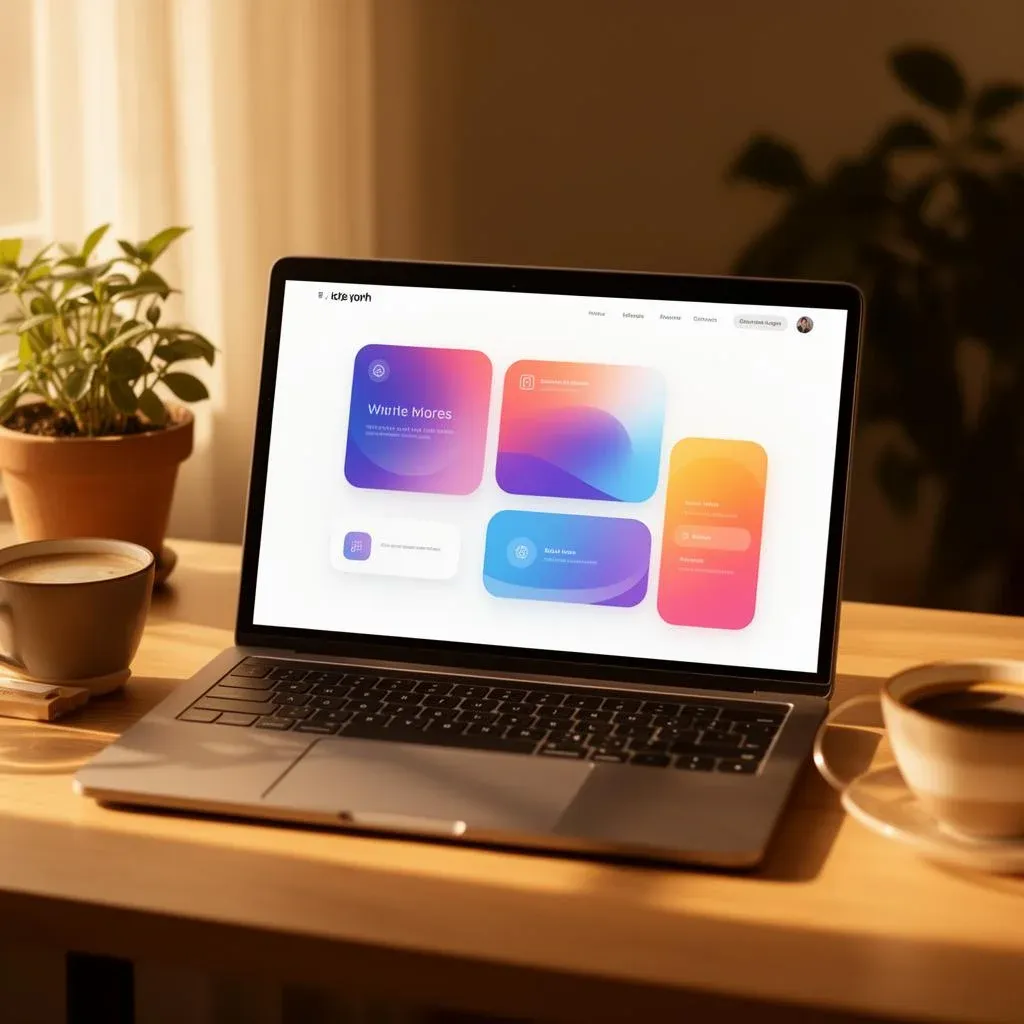
Let's be honest: the majority of AI-generated websites feel flat. Same layout, same gradients, same generic stock-photo energy. They work – but they don't feel like anything.
The best sites in the world are different. They feel responsive, layered, and interactive. They react to you. They guide your attention. They make you want to scroll.
The good news? You can build websites like that with Lovable – without writing code from scratch. Here's how.
Layer 1: Layout Structure
Every immersive site starts with clear, purposeful content blocks. Think of your page as a sequence of self-contained sections, each with a specific job:
- Hero – your first impression, your boldest statement
- Feature sections – what you offer, broken into digestible pieces
- Interactive demos – let users experience, not just read
- Social proof – testimonials, logos, metrics that build trust
- Call to action – one clear next step
The key principle: each section should stand on its own. If someone scrolls to any part of your page, they should immediately understand what they're looking at and why it matters.
In Lovable, you can prompt each section individually:
"Create a hero section with a bold headline, subtext, and a CTA button. Use a gradient background with a subtle animated pattern."
"Add a social proof section with a testimonial carousel, showing author photos and company logos."
Build section by section. Refine as you go.
Layer 2: The Interaction Layer
Static pages are forgettable. Interaction makes your site feel alive.
Add interactivity to the elements users naturally engage with:
- Cards – hover states that reveal deeper information
- Feature modules – expandable sections with animated transitions
- Navigation – smooth scrolling, sticky headers, active state indicators
- Product previews – toggleable views, before/after sliders
- Pricing sections – interactive toggles between monthly and annual plans
Examples That Work
| Pattern | Effect |
|---|---|
| Hover states on cards | Reveal additional info without cluttering the layout |
| Expandable cards | Let users dive deeper on their own terms |
| Animated tabs | Guide attention between content areas |
| Scroll-triggered transitions | Create a sense of progression and narrative |
In Lovable, you can add these with natural prompts:
"Make the feature cards expandable on click, with a smooth height animation. Show a short description by default, and reveal the full description with bullet points when expanded."
"Add a hover effect to the pricing cards – subtle scale and shadow increase."
Layer 3: Motion and Feedback
Motion is where good sites become great sites. But there's a fine line between polished and distracting.
The Rules of Good Motion
- Be intentional – every animation should serve a purpose (guide attention, show state change, create continuity)
- Be restrained – if everything moves, nothing stands out
- Be consistent – same easing, similar durations, predictable patterns
What to Animate
- Scroll reveals – fade elements in as the user scrolls down
- Hover animations – subtle scale, color shifts, or shadow changes
- Micro-interactions – button press feedback, toggle animations, loading states
- Component transitions – smooth entrance/exit when content changes
Lovable + Framer Motion
Lovable projects come with Framer Motion built in, making it easy to add production-quality animations:
"Add scroll-triggered fade-in animations to each section. Elements should fade in from below with a slight delay between items."
"When the user hovers over a card, scale it to 1.03 and add a soft shadow transition."
The goal: motion should feel like a natural extension of the content, not a layer on top of it.
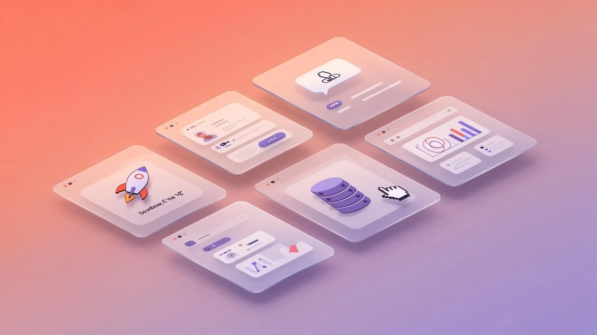
Layer 4: Component-Driven Sections
This is where most AI-generated sites fall short. Instead of static layouts, build reusable, interactive components that make your site feel like a product, not a brochure.
Components That Create Engagement
| Component | What It Does |
|---|---|
| Feature comparison slider | Let users drag to compare two states side by side |
| Expandable product cards | Reveal specs, pricing, or details on demand |
| Dynamic pricing tables | Toggle between plans, highlight recommended options |
| Interactive process timelines | Walk users through steps with progress indicators |
| Toggleable product demos | Switch between views, themes, or configurations |
These components keep users engaged without adding complexity – because each one is self-contained and reusable.
In Lovable:
"Build an interactive pricing section with three tiers. Add a monthly/annual toggle that animates the price change. Highlight the recommended plan with a badge and a subtle glow effect."
"Create a process timeline with 5 steps. Each step expands on click to show details. Add a progress bar that fills as the user scrolls through the steps."
Putting It All Together
The magic of immersive websites isn't any single technique – it's the layering:
- Structure gives your content a clear rhythm
- Interaction makes the experience feel responsive
- Motion adds polish and personality
- Components turn static pages into engaging experiences
When these layers work together, your site doesn't just inform – it performs.
Quick-Start Checklist
Here's a practical checklist for your next Lovable project:
- Plan your sections before prompting (Hero → Features → Proof → CTA)
- Add at least one interactive element per section
- Use scroll-triggered animations for content reveals
- Build one "signature" component that makes your site memorable
- Test hover states and transitions on both desktop and mobile
- Keep animations under 300ms for snappy feedback
- Use consistent easing curves across all motion
Start Building
The gap between "generic AI site" and "immersive web experience" isn't about code complexity – it's about intentional design decisions. Layout, interaction, motion, and components. Four layers. One cohesive experience.
Lovable gives you the tools. Your job is to think in layers.
→ Try Lovable for free | → Learn more about Lovable | → Get in touch
Building something ambitious? Let's talk about how we can help you create a web experience that stands out.
Want to take it further? Our guide Vibe Coding 3D Websites shows you how to build impressive 3D experiences with Spline, React Three Fiber, and Lovable.
Related Articles
 Deep Dive
Lovable Feature Roundup: What actually mattered in May and June 2026
Subagents, native Claude MCP, the Preview Toolbar, Publish-from-chat, slow-query analysis in Lovable Cloud: in six weeks…
Read more
Ponytail: The Best Code Is the Code You Never Wrote
A dev built Ponytail because his AI agents wrote 500 lines for a 5-line problem. The result: 80-94% less code, 47-77% ch…
Read more
Website Builders vs. AI-Native Stack: Which Path Wins in 2026?
Wix, Squarespace, Jimdo & co. vs. an AI-native stack with Lovable, Cloud and edge hosting – when does each really pay of…
Read more
Cloudflare vs. Vercel – Which One Should You Use When?
Vercel or Cloudflare? Both host your modern web app at the edge – but they pursue fundamentally different strategies. We…
Read more
Vibe Coding with Subagents: How We Parallelize Lovable Projects
Subagents in Lovable change how we approach large projects. A CTO view: what shifted in architecture, prompting and PR r…
Read more Deep Dive
From GPT Engineer to Today: The Complete Lovable Journey in 6 Theses
From the GPT Engineer repo in June 2023, through the Lovable launch in late 2024, to Beyond Apps, Skills, Mobile, Vent T…
Read more
Lovable Subagents: Parallel Research, One Orchestrating Head Agent
Lovable introduces subagents: read-only helpers that explore your codebase and the web in parallel, each with its own co…
Read more
Lovable's Vent Tool: When the Agent Reports Its Own Bugs
Lovable gave its agent a vent: it posts its frustrations directly into Slack. A second agent checks whether the vent bec…
Read more
Lovable Now Connects to Google Workspace and Gemini Enterprise
Gmail, Calendar, Drive, Sheets, Slides, Maps Platform, BigQuery and Gemini Enterprise – Lovable now builds apps on the d…
Read more