Build a SaaS Dashboard with Lovable: From Prompt to Production

TL;DR: „A SaaS dashboard that used to take 2 weeks – built in one afternoon. With Lovable, Recharts, and Lovable Cloud."
— Till FreitagWarum ein SaaS Dashboard als Lovable-Projekt?
Dashboards sind der perfekte Use Case für Vibe Coding: Viel UI, klare Datenstrukturen, wiedererkennbare Patterns. Statt wochenlang Komponenten zu verdrahten, beschreibst du, was du brauchst – und Lovable baut es.
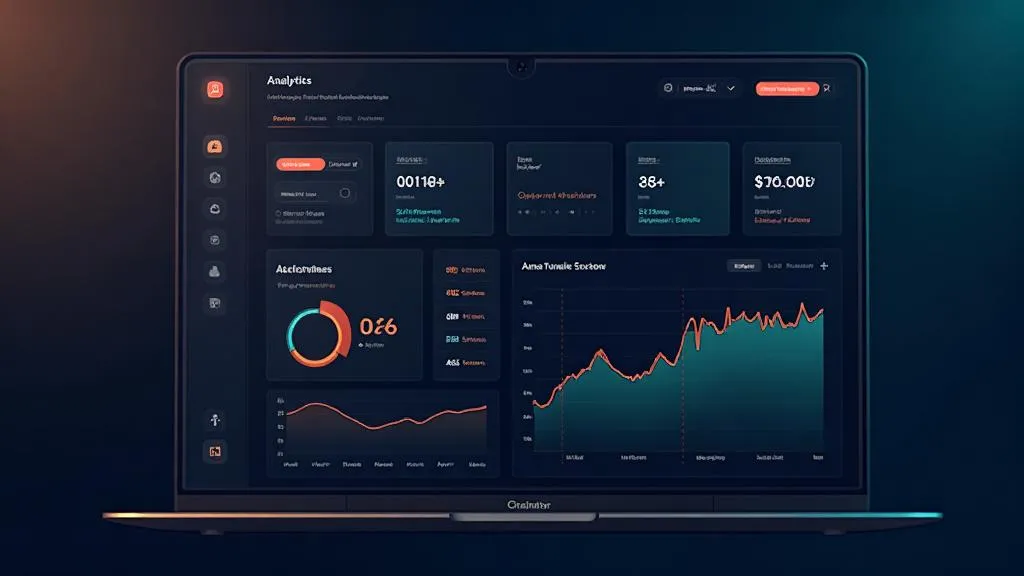
In diesem Tutorial bauen wir ein Analytics Dashboard für ein SaaS-Produkt – mit:
- 📊 KPI-Karten (MRR, Churn, Active Users, ARPU)
- 📈 Interaktive Charts (Revenue Trend, User Growth)
- 📋 Datentabelle mit Sortierung und Filter
- 🔐 Authentication (Login/Signup)
- 💾 Echte Datenbank mit Lovable Cloud
Zeitaufwand: ~3-4 Stunden für das komplette Setup.
Schritt 1: Projekt anlegen und Layout prompten
Starte ein neues Lovable-Projekt und beschreibe das Grundlayout:
Erstelle ein SaaS Analytics Dashboard mit:
- Sidebar-Navigation (Dashboard, Customers, Settings)
- Header mit User-Avatar und Notification-Bell
- Main Content Area mit 4 KPI-Karten oben
- Darunter 2 Charts nebeneinander (Line Chart + Bar Chart)
- Unten eine Datentabelle mit Kunden

Nutze ein dunkles Farbschema mit Blau-Akzenten.
Lovable generiert daraus ein funktionierendes Layout – inklusive responsivem Design und Shadcn/UI-Komponenten.
Was Lovable sofort richtig macht:
- Shadcn/UI-Komponenten für Cards, Tables, Navigation
- Tailwind CSS für konsistentes Styling
- React Router für Seitennavigation
- Responsive Grid das auf Mobile stackt
Schritt 2: KPI-Karten mit echten Metriken
Die vier wichtigsten SaaS-Metriken als Karten:
Erstelle 4 KPI-Karten im Dashboard:
1. Monthly Recurring Revenue (MRR) – €24.500, +12% vs. Vormonat
2. Churn Rate – 2.1%, -0.3% vs. Vormonat
3. Active Users – 1.247, +89 diese Woche
4. ARPU – €19.60, +€1.20 vs. Vormonat

Jede Karte zeigt: Metrik-Name, Wert, Trend-Indikator (grün/rot),
Sparkline-Mini-Chart der letzten 7 Tage.
Tipp: Lovable kennt Recharts – die Library ist im Standard-Stack enthalten. Du musst sie nicht manuell installieren.
Schritt 3: Interaktive Charts aufsetzen
Jetzt kommen die Charts. Lovable nutzt Recharts unter der Haube:
Erstelle zwei Charts nebeneinander:

1. Line Chart "Revenue Trend" – zeigt MRR der letzten 12 Monate.
   Mit Tooltip bei Hover und Gradient-Fill unter der Linie.

2. Bar Chart "New vs. Churned Users" – gestapeltes Balkendiagramm,
   neue User (blau) vs. abgewanderte User (rot) pro Monat.

Nutze Mock-Daten die realistisch aussehen.
Pro-Tipps für Charts in Lovable:
- Recharts ResponsiveContainer – Lovable wrapped Charts automatisch responsive
- Custom Tooltips – Prompte "Erstelle einen Custom Tooltip mit Formatierung"
- Animationen –
animationDuration={1000}für smooth Entry-Animationen - Dark Mode – Achte auf
strokeundfillFarben im dunklen Theme
Schritt 4: Datentabelle mit Sortierung
Für die Kundentabelle:
Erstelle eine Datentabelle "Recent Customers" mit den Spalten:
- Name (mit Avatar)
- E-Mail
- Plan (Free/Pro/Enterprise als Badge)
- MRR (Wert in €)
- Status (Active/Churned als farbiger Badge)
- Joined (Datum)

Füge Sortierung per Klick auf Spaltenheader hinzu.
Zeige 10 Einträge pro Seite mit Pagination.
Schritt 5: Authentication mit Lovable Cloud
Hier wird es spannend – das Dashboard soll nur für eingeloggte User zugänglich sein:
- Lovable Cloud aktivieren im Projekt
- Prompt:
Füge Authentication hinzu:
- Login-Seite mit E-Mail + Passwort
- Signup-Seite mit Registrierung
- Protected Routes: Dashboard nur für eingeloggte User
- Redirect zu /login wenn nicht authentifiziert
- User-Info im Header anzeigen (Name + Avatar)
Lovable Cloud stellt Authentifizierung bereit – ohne dass du eine externe Datenbank aufsetzen musst.
Schritt 6: Datenbank-Tabellen anlegen
Statt Mock-Daten wollen wir echte Persistenz:
Erstelle Datenbank-Tabellen:

1. "customers" – id, name, email, plan, mrr, status, joined_at, user_id
2. "metrics" – id, date, mrr, active_users, churn_rate, arpu, user_id

Füge RLS Policies hinzu: Jeder User sieht nur seine eigenen Daten.
Seed die Tabellen mit 50 Beispiel-Kunden und 12 Monaten Metrik-Daten.
Schritt 7: Dashboard mit echten Daten verbinden
Der letzte Schritt: Mock-Daten durch Datenbank-Queries ersetzen:
Verbinde das Dashboard mit den Datenbank-Tabellen:
- KPI-Karten lesen aus "metrics" (letzter Eintrag + Vormonatsvergleich)
- Charts lesen aus "metrics" (letzte 12 Monate)
- Kundentabelle liest aus "customers" mit Pagination
- Alle Queries nutzen den eingeloggten User als Filter
Das Ergebnis
Nach ~3-4 Stunden hast du:
| Feature | Status |
|---|---|
| Responsive Dashboard Layout | ✅ |
| 4 KPI-Karten mit Trends | ✅ |
| Interaktive Recharts-Charts | ✅ |
| Sortierbare Datentabelle | ✅ |
| Authentication (Login/Signup) | ✅ |
| Datenbank mit RLS | ✅ |
| Dark Mode | ✅ |
Das gleiche Projekt mit klassischer Entwicklung? 2-3 Wochen.
Häufige Stolpersteine (und wie du sie umgehst)
1. Charts rendern nicht korrekt
Problem: Recharts braucht eine feste Höhe oder einen ResponsiveContainer.
Lösung: Prompte "Wrappe den Chart in einen ResponsiveContainer mit height={300}"
2. RLS blockiert alle Daten
Problem: Nach dem Aktivieren von Row Level Security sind alle Tabellen "leer".
Lösung: Stelle sicher, dass die RLS Policy auth.uid() = user_id korrekt ist und die Seed-Daten die richtige user_id verwenden.
3. Auth-State geht beim Refresh verloren
Problem: Nach einem Page-Refresh ist der User ausgeloggt.
Lösung: Lovable Cloud handled Session-Persistence automatisch. Prüfe, ob der Auth-Provider korrekt im Root-Layout eingebunden ist.
4. Mobile Layout bricht
Problem: Die zwei Charts nebeneinander brechen auf Mobile.
Lösung: Prompte "Mache das Chart-Grid responsive: 2 Spalten auf Desktop, 1 Spalte auf Mobile"
Nächste Schritte
Wenn das Basis-Dashboard steht, kannst du erweitern:
- Stripe-Integration für echte Payment-Daten
- E-Mail-Notifications bei Churn-Alerts
- CSV-Export für Reporting
- Team-Zugang mit Role-based Access Control
- Custom Domain für ein professionelles Setup
Fazit: Dashboards sind der Sweet Spot für Vibe Coding
SaaS Dashboards kombinieren bekannte UI-Patterns (Cards, Charts, Tables) mit klaren Datenstrukturen – genau das, was AI-gestützte Entwicklung am besten kann.
Der Schlüssel: Prompte in Schritten, nicht alles auf einmal. Layout → Komponenten → Daten → Auth → Verbindung. So bleibt jeder Schritt überschaubar und Lovable liefert bessere Ergebnisse.
Du willst ein eigenes Dashboard bauen? Lovable kostenlos testen →
Verwandte Artikel

The Vibe Coding Stack 2026: Lovable, Supabase, Resend – And What's Still Missing
This is the tech stack we use to build full-stack apps in 2026 – without a traditional dev team. Three core tools, two f…
Weiterlesen
Lovable Pricing & Plans Explained – Is It Worth It?
What does Lovable actually cost? We break down all plans, credits, and hidden costs – with honest assessments of which p…
Weiterlesen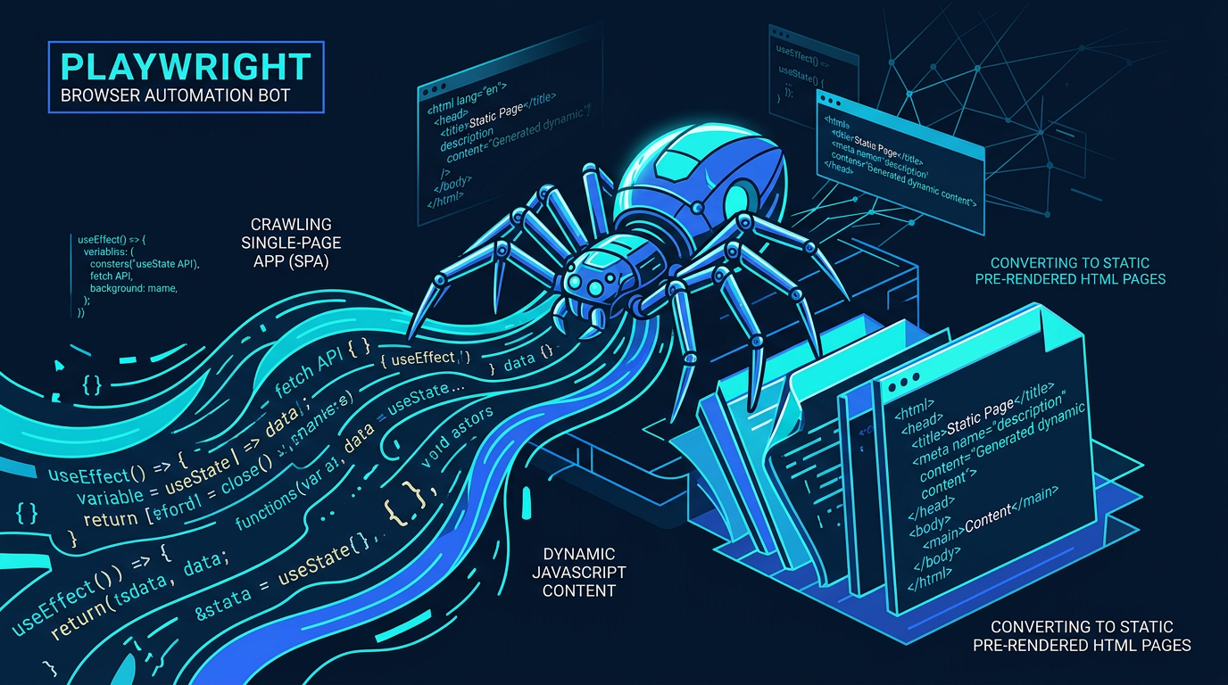
Playwright SSG Tutorial: How to Make Lovable Apps Visible to Google
SPAs are invisible to search engines. With Playwright, you can render any Lovable app into static HTML – automated, on e…
Weiterlesen
Build Forms in Lovable: React Hook Form, zod & Lovable Cloud Step by Step
Part 2 of the Lovable Forms series: how to build forms directly in Lovable – with React Hook Form, zod, shadcn/ui and Lo…
Weiterlesen
Ponytail: The Best Code Is the Code You Never Wrote
A dev built Ponytail because his AI agents wrote 500 lines for a 5-line problem. The result: 80-94% less code, 47-77% ch…
Weiterlesen Deep Dive
From GPT Engineer to Today: The Complete Lovable Journey in 6 Theses
From the GPT Engineer repo in June 2023, through the Lovable launch in late 2024, to Beyond Apps, Skills, Mobile, Vent T…
Weiterlesen
Lovable Subagents: Parallel Research, One Orchestrating Head Agent
Lovable introduces subagents: read-only helpers that explore your codebase and the web in parallel, each with its own co…
Weiterlesen
Lovable's Vent Tool: When the Agent Reports Its Own Bugs
Lovable gave its agent a vent: it posts its frustrations directly into Slack. A second agent checks whether the vent bec…
Weiterlesen
Lovable Now Connects to Google Workspace and Gemini Enterprise
Gmail, Calendar, Drive, Sheets, Slides, Maps Platform, BigQuery and Gemini Enterprise – Lovable now builds apps on the d…
Weiterlesen