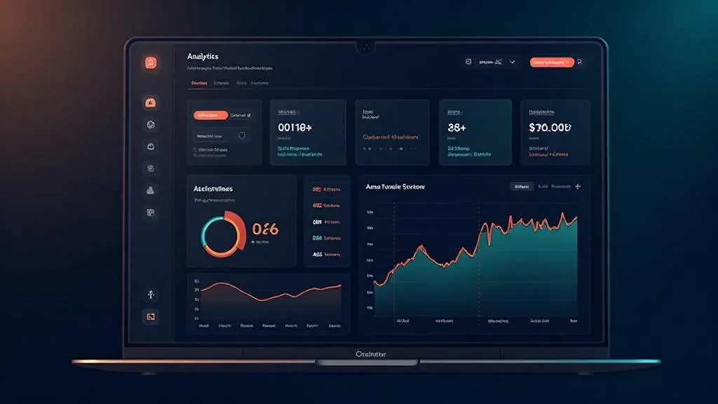
SaaS Dashboard mit Lovable bauen: Vom Prompt zum fertigen Produkt

TL;DR: „Ein SaaS Dashboard, für das du früher 2 Wochen gebraucht hättest – in einem Nachmittag. Mit Lovable, Recharts und Lovable Cloud."
— Till FreitagWhy a SaaS Dashboard Is the Perfect Lovable Project
Dashboards are the ideal use case for vibe coding: lots of UI, clear data structures, recognizable patterns. Instead of spending weeks wiring up components, you describe what you need – and Lovable builds it.
In this tutorial, we'll build an analytics dashboard for a SaaS product – with:
- 📊 KPI cards (MRR, Churn, Active Users, ARPU)
- 📈 Interactive charts (Revenue Trend, User Growth)
- 📋 Data table with sorting and filtering
- 🔐 Authentication (Login/Signup)
- 💾 Real database with Lovable Cloud
Time investment: ~3–4 hours for the complete setup.
Step 1: Create the Project and Prompt the Layout
Start a new Lovable project and describe the basic layout:
Create a SaaS analytics dashboard with:
- Sidebar navigation (Dashboard, Customers, Settings)
- Header with user avatar and notification bell
- Main content area with 4 KPI cards at the top
- Below that, 2 charts side by side (Line Chart + Bar Chart)
- At the bottom, a data table with customers

Use a dark color scheme with blue accents.
Lovable generates a working layout from this – including responsive design and Shadcn/UI components.
What Lovable Gets Right Immediately:
- Shadcn/UI components for cards, tables, navigation
- Tailwind CSS for consistent styling
- React Router for page navigation
- Responsive grid that stacks on mobile
Step 2: KPI Cards with Real Metrics
The four most important SaaS metrics as cards:
Create 4 KPI cards in the dashboard:
1. Monthly Recurring Revenue (MRR) – $24,500, +12% vs. last month
2. Churn Rate – 2.1%, -0.3% vs. last month
3. Active Users – 1,247, +89 this week
4. ARPU – $19.60, +$1.20 vs. last month

Each card shows: metric name, value, trend indicator (green/red),
sparkline mini-chart for the last 7 days.
Tip: Lovable knows Recharts – the library is included in the default stack. You don't need to install it manually.
Step 3: Set Up Interactive Charts
Now for the charts. Lovable uses Recharts under the hood:
Create two charts side by side:

1. Line Chart "Revenue Trend" – shows MRR for the last 12 months.
   With tooltip on hover and gradient fill under the line.

2. Bar Chart "New vs. Churned Users" – stacked bar chart,
   new users (blue) vs. churned users (red) per month.

Use mock data that looks realistic.
Pro Tips for Charts in Lovable:
- Recharts ResponsiveContainer – Lovable automatically wraps charts responsively
- Custom Tooltips – Prompt "Create a custom tooltip with formatting"
- Animations –
animationDuration={1000}for smooth entry animations - Dark Mode – Watch
strokeandfillcolors in the dark theme
Step 4: Data Table with Sorting
For the customer table:
Create a data table "Recent Customers" with columns:
- Name (with avatar)
- Email
- Plan (Free/Pro/Enterprise as badge)
- MRR (value in $)
- Status (Active/Churned as colored badge)
- Joined (date)

Add sorting by clicking on column headers.
Show 10 entries per page with pagination.
Step 5: Authentication with Lovable Cloud
This is where it gets exciting – the dashboard should only be accessible to logged-in users:
- Enable Lovable Cloud in the project
- Prompt:
Add authentication:
- Login page with email + password
- Signup page with registration
- Protected routes: Dashboard only for logged-in users
- Redirect to /login when not authenticated
- Show user info in header (name + avatar)
Lovable Cloud provides authentication out of the box – no external database setup required.
Step 6: Create Database Tables
Instead of mock data, we want real persistence:
Create database tables:

1. "customers" – id, name, email, plan, mrr, status, joined_at, user_id
2. "metrics" – id, date, mrr, active_users, churn_rate, arpu, user_id

Add RLS policies: Each user only sees their own data.
Seed the tables with 50 sample customers and 12 months of metric data.
Step 7: Connect Dashboard to Real Data
The final step: Replace mock data with database queries:
Connect the dashboard to the database tables:
- KPI cards read from "metrics" (latest entry + month-over-month comparison)
- Charts read from "metrics" (last 12 months)
- Customer table reads from "customers" with pagination
- All queries filter by the logged-in user
The Result
After ~3–4 hours, you have:
| Feature | Status |
|---|---|
| Responsive dashboard layout | ✅ |
| 4 KPI cards with trends | ✅ |
| Interactive Recharts charts | ✅ |
| Sortable data table | ✅ |
| Authentication (Login/Signup) | ✅ |
| Database with RLS | ✅ |
| Dark mode | ✅ |
The same project with traditional development? 2–3 weeks.
Common Pitfalls (and How to Avoid Them)
1. Charts Don't Render Correctly
Problem: Recharts needs a fixed height or a ResponsiveContainer.
Solution: Prompt "Wrap the chart in a ResponsiveContainer with height={300}"
2. RLS Blocks All Data
Problem: After enabling Row Level Security, all tables appear "empty."
Solution: Make sure the RLS policy auth.uid() = user_id is correct and that seed data uses the right user_id.
3. Auth State Lost on Refresh
Problem: After a page refresh, the user is logged out.
Solution: Lovable Cloud handles session persistence automatically. Check that the auth provider is correctly embedded in the root layout.
4. Mobile Layout Breaks
Problem: The two side-by-side charts break on mobile.
Solution: Prompt "Make the chart grid responsive: 2 columns on desktop, 1 column on mobile"
Next Steps
Once the basic dashboard is in place, you can extend it:
- Stripe integration for real payment data
- Email notifications for churn alerts
- CSV export for reporting
- Team access with role-based access control
- Custom domain for a professional setup
Conclusion: Dashboards Are the Sweet Spot for Vibe Coding
SaaS dashboards combine well-known UI patterns (cards, charts, tables) with clear data structures – exactly what AI-assisted development does best.
The key: Prompt in steps, not all at once. Layout → Components → Data → Auth → Connection. This keeps each step manageable and Lovable delivers better results.
Want to build your own dashboard? Try Lovable for free →
Related Articles
Der Vibe Coding Stack 2026: Lovable, Supabase, Resend – und was noch fehlt
Das ist der Tech-Stack, mit dem wir 2026 Full-Stack-Apps bauen – ohne klassisches Dev-Team. Drei Tools im Kern, zwei für…
Read more
Lovable Preise & Pläne erklärt – Lohnt sich das?
Was kostet Lovable wirklich? Wir erklären alle Pläne, Credits und versteckte Kosten – mit ehrlicher Einschätzung, für we…
Read more
Playwright SSG Tutorial: So machst du Lovable Apps für Google sichtbar
SPAs sind für Suchmaschinen unsichtbar. Mit Playwright kannst du jede Lovable App in statisches HTML rendern – automatis…
Read more
Formulare in Lovable selber bauen: React Hook Form, zod & Lovable Cloud Schritt für Schritt
Teil 2 der Lovable-Forms-Serie: Wie du Formulare direkt in Lovable baust – mit React Hook Form, zod, shadcn/ui und Lovab…
Read more
Lovable Feature-Roundup: Was im Mai und Juni 2026 wirklich wichtig wurde
Subagents, native Claude-MCP, Preview-Toolbar, Publish-from-Chat, Slow-Query-Analyse: In sechs Wochen hat Lovable mehr a…
Read more
Ponytail: Warum der beste Code der Code ist, den du nie geschrieben hast
Ein Dev hat Ponytail gebaut – weil seine AI-Agenten 500 Zeilen für ein 5-Zeilen-Problem schrieben. Das Ergebnis: 80-94% …
Read more
Lovable Model-Routing: Warum sich der Output für Builder schlechter anfühlt
Lovable routet inzwischen je nach Aufgabe auf unterschiedliche Modelle. Aus Builder-Sicht ist der Output dadurch in drei…
Read more
Vibe Coding mit Subagents: Wie wir Lovable-Projekte parallelisieren
Subagents in Lovable verändern, wie wir große Projekte angehen. Aus der CTO-Sicht: was sich an Architektur, Prompting un…
Read more Deep Dive
Von GPT Engineer bis heute: Die komplette Lovable-Reise in 6 Thesen
Vom GPT-Engineer-Repo im Juni 2023 über den Lovable-Launch Ende 2024 bis zu Beyond Apps, Skills, Mobile, Vent Tool, Goog…
Read more